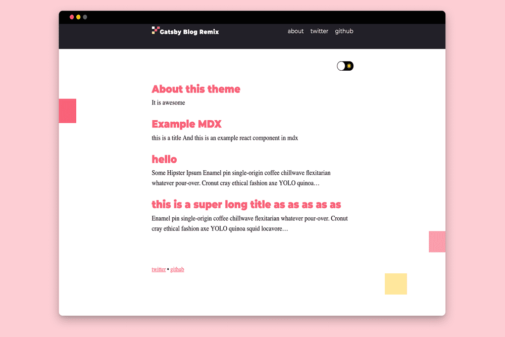
About this theme
The Gatsby blog theme Remixed
A remix of the classic Gatsby Blog Theme.
Why this theme?
Gatsby Blog Remix takes the tried and true Gatsby Theme Blog and adds a splash of style and color. This theme is a great jumping off point to get you started. The Gatsby Blog Remix components are all easily shadowable, and have been themed by theme-ui to make the customization of easy as possible.
Features
- Theme-ui
- Easy to shadow components
- Pre-built name-spaced component shadowing folder
- Light and Darkmode
- MDX support
- Desktop and Mobile Navigation component
- Portals
Installation
Use the blog remixed theme starter in a new site
This will generate a new site that pre-configures use of Gatsby Blog Remix.
gatsby new my-themed-blog https://github.com/joshatoutthink/gatsby-theme-blog-remix-demo
Manually add to your site
npm install --save @joshkennedy00/gatsby-theme-blog-remix
Usage
Theme options
| Key | Default value | Description |
|---|---|---|
basePath | / | Root url for all blog posts |
contentPath | /content/posts | Location of blog posts |
assetPath | /content/assets | Location of assets |
mdx | true | Configure gatsby-plugin-mdx (if your website already is using the plugin pass false to turn this off) |
Example usage
// gatsby-config.jsmodule.exports = {plugins: [{resolve: `gatsby-theme-blog`,options: {// basePath defaults to `/`basePath: `/blog`,},},],}
Additional configuration
Site Metadata
In addition to the theme options, there are a handful of items you can customize via the siteMetadata object in your site’s gatsby-config.js
// gatsby-config.jsmodule.exports = {siteMetadata: {// Used for the site title and SEOtitle: `Gatsby Theme Remix`,// Used to provide alt text for your avatarauthor: `Josh Kennedy`,//used in the post footershortBio: `a web designer and developer.`,// Used for SEOdescription: `This is a remix of the theme Gatsby Theme Blog. Changed some styling, added some components, also made extra comments to make extending this theme easier`,// Used for social links in the root footersocial: [{name: `twitter`,url: `https://twitter.com/JoshKen08672181`,},{name: `github`,url: `https://github.com/joshatoutthink`,},],},}
Images
Gatsby Blog Remix comes with the option to add:
- site logo
- author avatar
Site logo
Place a svg, jpg, or png named logo in the assets folder.
There is also the option to add a darkmode version of the logo. To add this logo maker sure to name it logo-dark.
Author Avatar
- Place a jpg, or png named avatar in the assets folder.
Customize Components
Gatsby Blog Remix layout uses theme-ui’s layout components. Within those components exists modular components that makes it easy to shadow, and create your own remix.
Shadowing a Component
Components
To shadow a component or edit the components from this theme you copy the component into your site with this folder structure:
./src/THEMENAME/components
However this theme Prebuilds a name-spaced folder in your source folder for you. All you have to do is paste in the components into the prebuild name-spaced components folder. All maker all paths reference other compents change from
import Navigation from './Navigation'
to
import { Navigation } from '@joshkennedy00/gatsby-theme-blog-remix'
once the component is copied over you can delete, add, and edit till you are blue in the face.
Templates
The Gatsby Blog Remix theme only creates the components folder automatically. If you would like to shadow the post template and posts template you will have add the templates folder to the @joshkennedy00/gatsby-theme-blog-remix folder.
Customizing the Style
Gatsby Blog Remix uses theme UI to style the components and mdx. Take a look at their documentation to learn more about styling this theme and making it your own.
theme-ui docs
Portals
Blog Remix’s mobile navigation makes use of react portals. They are fun ways to have modals, mobile navigations, and overlays. Portals provide a first-class way to render children into a DOM node that exists outside the DOM hierarchy of the parent component without having to do any redux or global store nonesense. See react’s portals, or just use the component included in this theme. also see Scott Tolinski’s tutorial on Portals
